


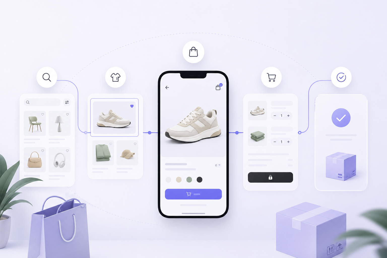
Most e-commerce problems are not caused by one dramatic design mistake. They come from small moments of uncertainty: unclear categories, weak product information, hidden delivery costs, confusing size choices, a cart that loses context, or a checkout that asks for too much. A stronger buying journey removes these doubts one step at a time. The aim is not to pressure people into purchasing. It is to help them understand the product, trust the store, and complete a decision with confidence.
Article summary
Key takeaways
- Clear product information reduces hesitation before checkout.
- The cart and checkout should preserve context and avoid surprises.
- Post-purchase communication is part of the customer experience.
Make products easy to find
Customers rarely browse a store using the same language as the internal product team. Navigation should reflect how people think about the product: by purpose, category, style, problem, audience, or occasion. Labels that make sense inside the business may still be unclear to a first-time visitor.
Search and filters become essential as the catalogue grows. Filters should use meaningful attributes and show selected values clearly. Empty results should suggest a useful next step rather than ending the journey. On mobile, filters must remain visible enough to discover without covering the product list with unnecessary controls.
The product grid should help people compare. Consistent imagery, readable names, prices, important variations, and availability give users enough information to decide which item deserves a closer look.
Answer questions on the product page
A product page should reduce uncertainty in the order customers are likely to experience it. What is the product? Is it suitable for me? Which option should I choose? When will it arrive? Can I return it? The design should make these answers easy to scan without forcing the customer through long blocks of promotional copy.
Images need to show context, scale, detail, and important variations. Descriptions should explain benefits without hiding practical specifications. Size guides, materials, compatibility information, stock status, delivery estimates, and return conditions should appear close to the decision they affect.
The main action should be clear, but clarity does not require aggressive design. A visible price, selected variation, quantity, and add-to-cart button often create more confidence than repeated urgency messages.
A strong product page does not simply sell the item. It answers the questions that prevent the customer from buying it.
Keep the cart useful
The cart is not only a list of products. It is a review step where customers confirm selections, quantities, costs, and delivery expectations. Product images, names, selected options, and editable quantities should remain visible so users do not need to return to the product page to verify their choices.
Unexpected costs are one of the fastest ways to damage trust. Shipping, taxes, discounts, and thresholds should be explained as early as the store can reasonably calculate them. When a promotion does not apply, the interface should explain why instead of silently rejecting the code.
- Allow quantities and variations to be corrected easily.
- Keep the order summary visible and understandable.
- Show delivery information before the final payment step.
- Preserve the cart when a customer leaves or signs in.
Simplify checkout
Checkout should ask only for information required to complete the order. Guest checkout is important because account creation can feel like an unrelated task at the moment of purchase. Customers can be offered an account after the order, when the benefits are easier to explain.
Forms should use clear labels, sensible defaults, appropriate input types, and immediate error messages. The interface should preserve valid information after an error and move focus toward the field that needs attention. Payment failures need calm, specific recovery guidance rather than a generic message.
A progress indicator can help when checkout has several meaningful steps, but unnecessary pages create more friction. The right number of steps depends on the information required, not on a fixed design pattern.
Continue the experience after purchase
The journey does not end when payment succeeds. The confirmation page should show the order number, purchased items, delivery address, payment summary, expected timing, and what happens next. Customers should not need to search their inbox to confirm that the order exists.
Order emails, tracking updates, support information, cancellations, returns, and refunds are all product experiences. Clear communication reduces support requests and protects trust when delivery is delayed or an item needs to be returned.
The best e-commerce teams review the whole journey using customer feedback, analytics, search terms, abandoned sessions, support tickets, and usability testing. Conversion matters, but repeat purchases and fewer avoidable questions often reveal whether the experience is genuinely improving.
Final perspective
Better commerce comes from less uncertainty
An effective e-commerce journey helps customers find the right product, understand it, review their decision, pay without surprises, and know what will happen after the order.
The strongest improvements are often practical rather than dramatic: clearer information, visible costs, better form behaviour, useful recovery states, and consistent communication. When every step answers the customer's next question, buying becomes easier and trust becomes stronger.