Dark tech (Option 1)
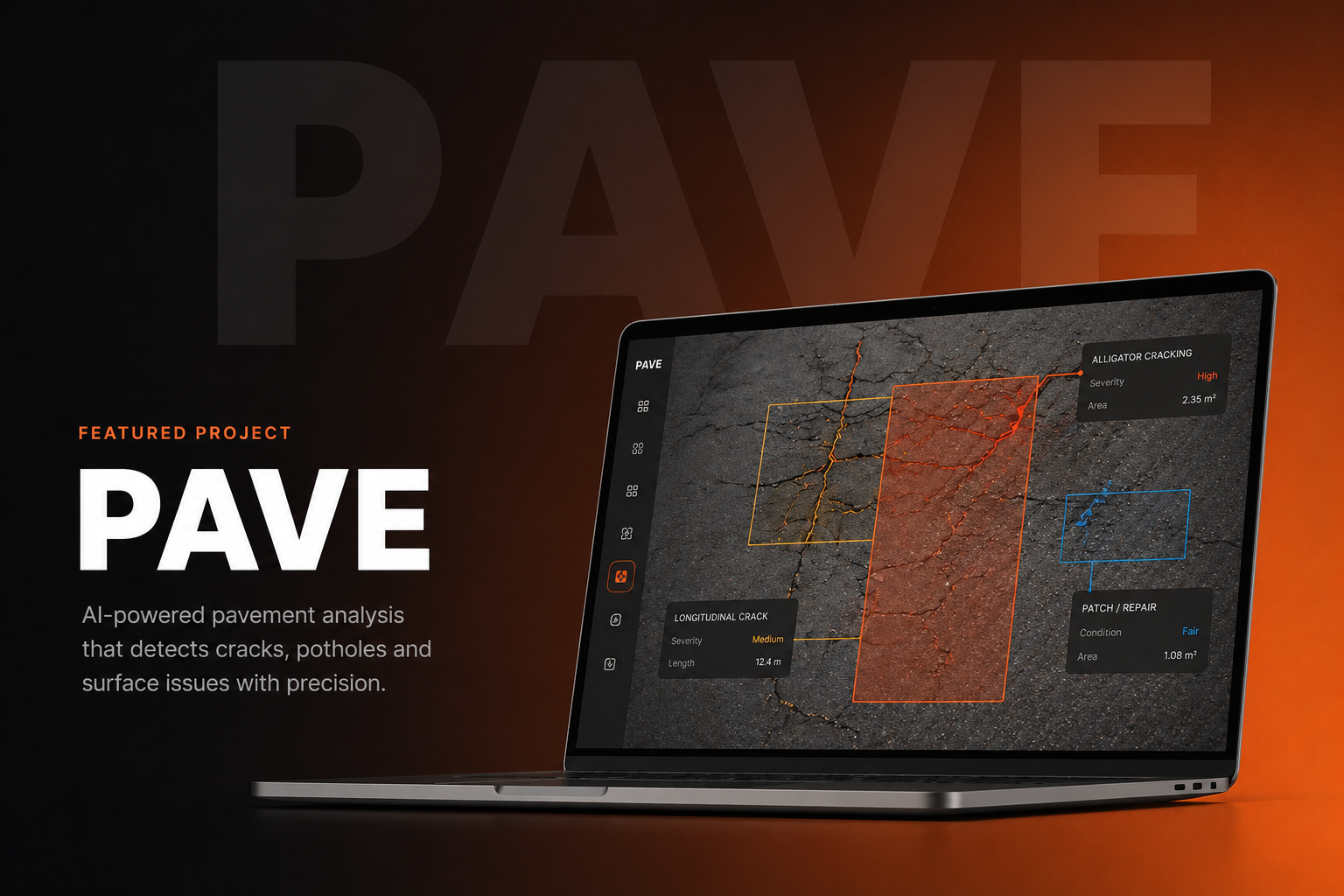
A dark navy base with orange accents and a live road-scanning visual in the hero. Signals precision, authority, and AI capability — built for a procurement audience that expects enterprise software to look serious.
Infrastructure & Engineering / 2026
Giving a client a real choice — three complete homepage directions, not one take-it-or-leave-it design.
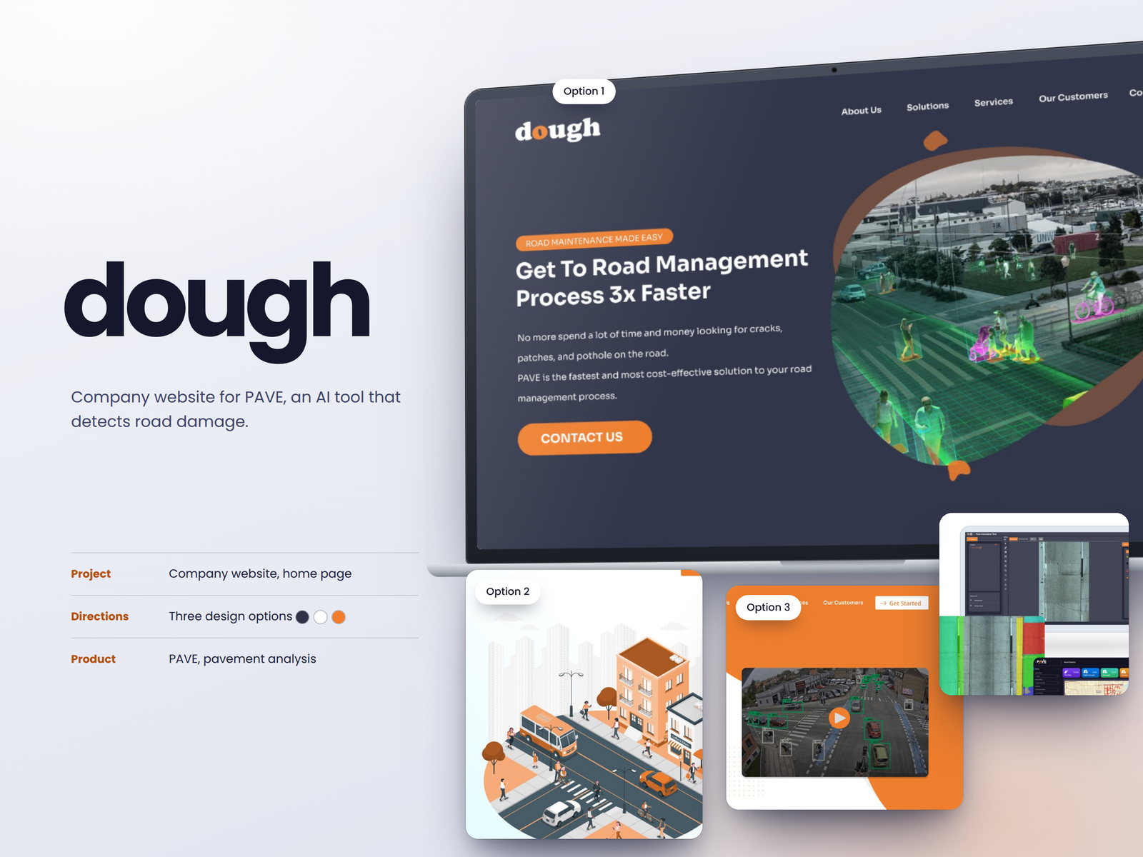
PAVE is an AI platform that detects road damage for municipalities and road management teams. We designed three full homepage directions for their company website, each presenting the same content in a different visual language.
Project overview
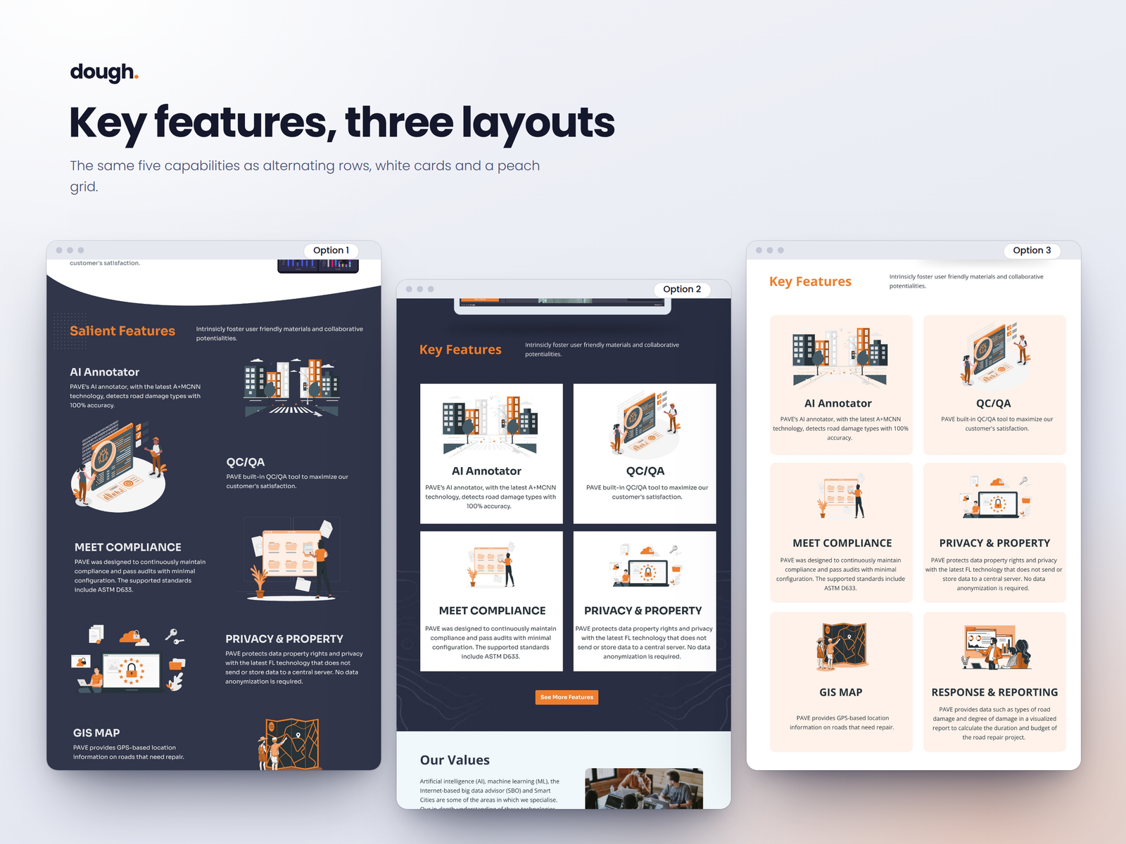
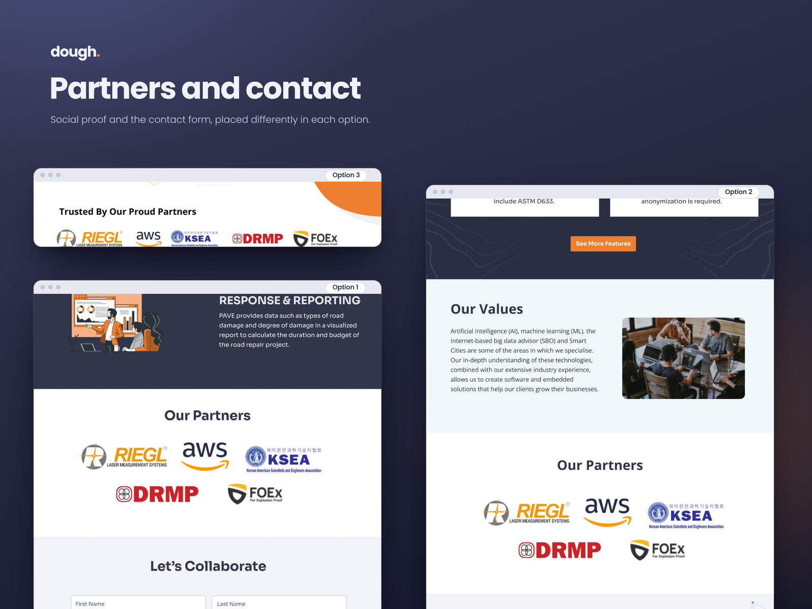
Each direction covers the full homepage: a hero with the core value proposition, a product section explaining PAVE's AI detection, a features section, a partners strip, and a contact form. All three are complete enough to be shipped — the exploration is about direction, not a rough sketch.
Designing three directions side by side forces real clarity about what each visual language is saying, independent of content.
The challenge
An AI infrastructure product has a positioning problem: it needs to feel technical enough to be credible with engineers and municipal procurement teams, but approachable enough that decision-makers who are not data scientists can understand the value quickly.
UX approach
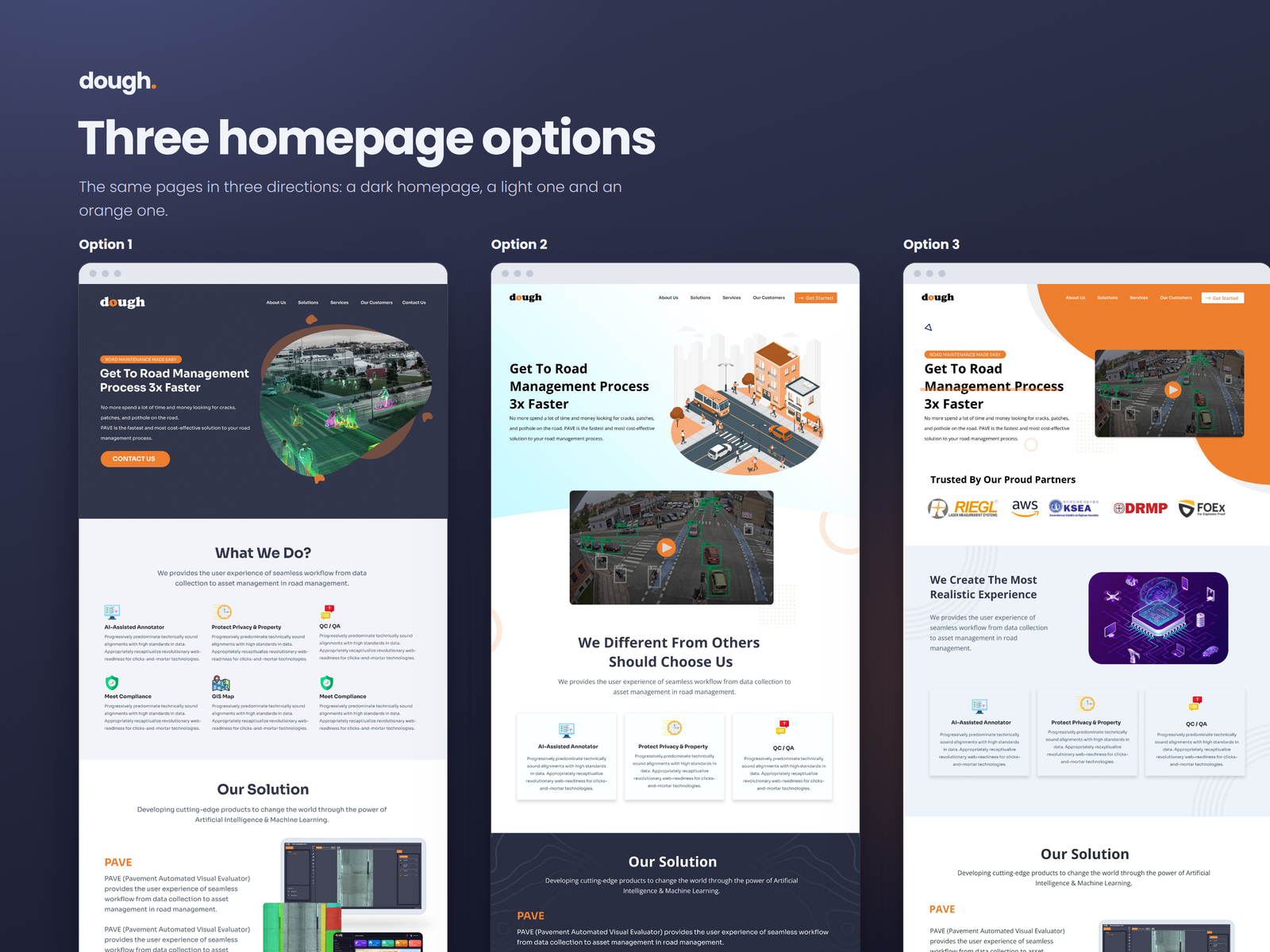
Each direction uses a distinct visual register to frame the same product for the same audience in a different way.
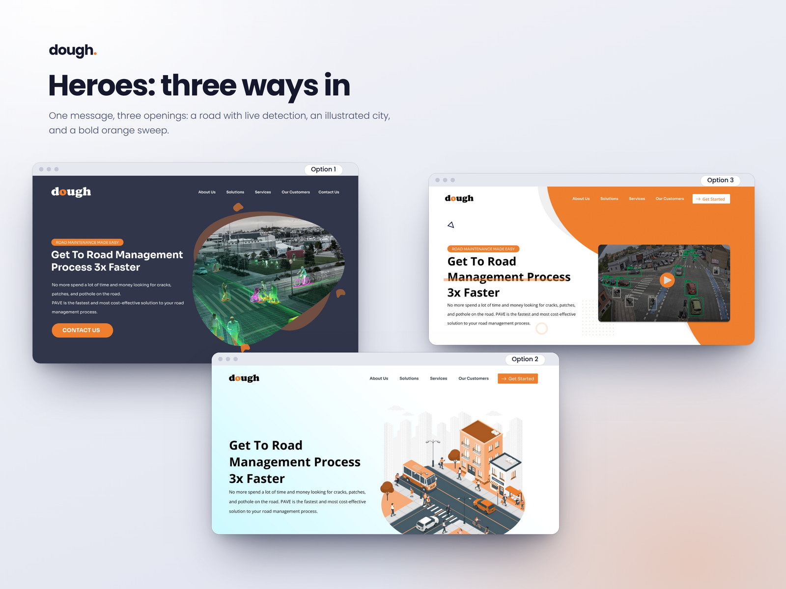
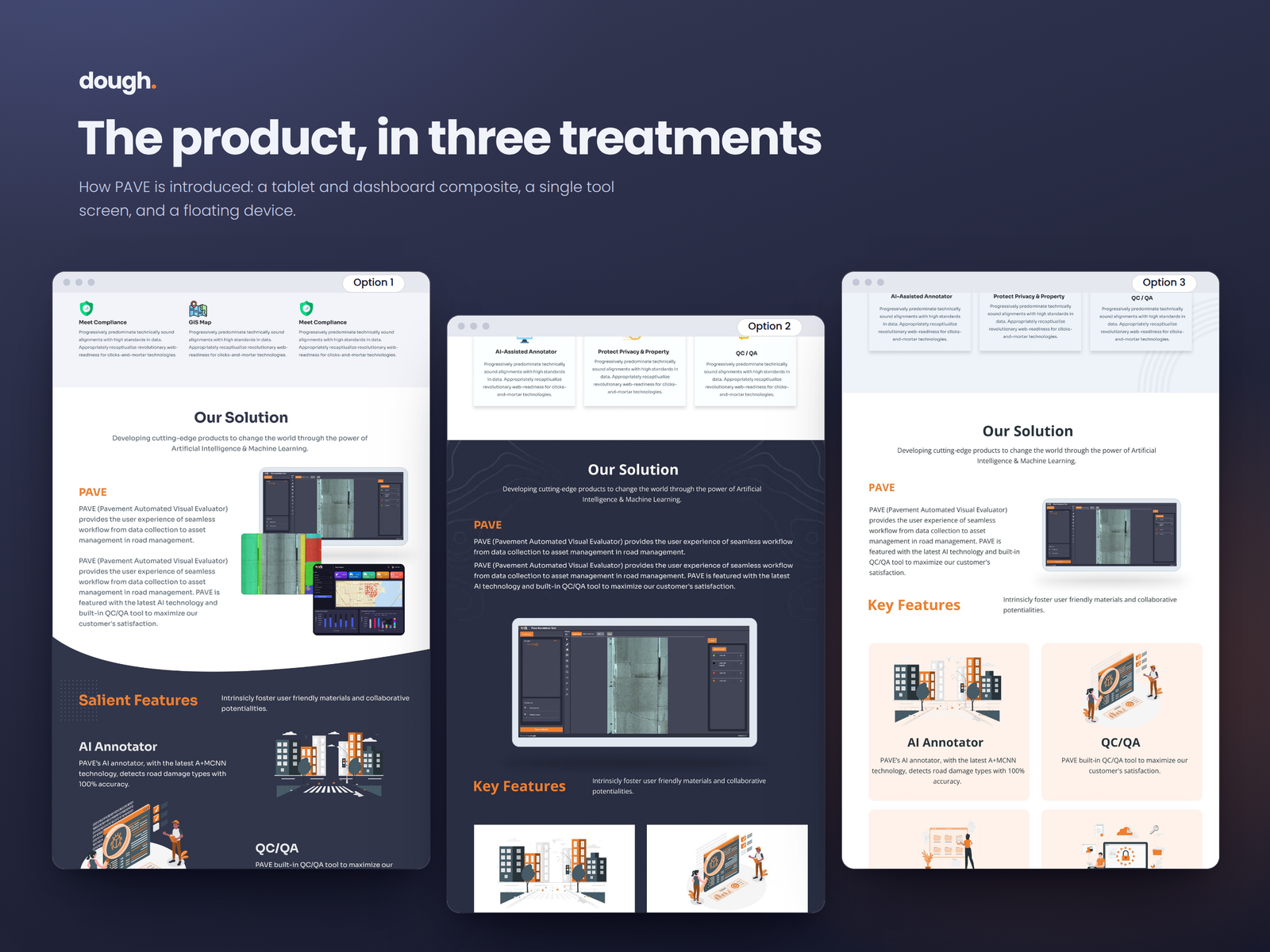
A dark navy base with orange accents and a live road-scanning visual in the hero. Signals precision, authority, and AI capability — built for a procurement audience that expects enterprise software to look serious.
A clean white base with an isometric city illustration, making the product feel approachable and solution-oriented rather than data-heavy. Softer, more consultative in tone.
A bold orange with high contrast and an application screenshot front and centre. Direct, energetic, and product-first — puts the actual tool in front of the decision-maker immediately.
All three share identical information architecture — hero, solution, features, partners, contact — so the client could compare directions on equal terms, section by section.
Selected work
Hero, product, features, partners, and contact — designed three ways.
UI and product direction
Each direction is a complete design system in miniature: its own colour palette, typographic weight, imagery treatment, and component style.
Our process
We agreed the five sections all three directions would cover: hero, product, features, partners, and contact.
We defined a colour system, typographic treatment, imagery approach, and component style for each direction before designing any screens.
We designed each direction as a complete homepage in Figma — not a rough concept, but a finished screen the client could evaluate properly.
We presented all three directions together, section by section, so the client could compare them at the same level of detail.
Execution
Each direction was designed to completion in Figma, covering all five homepage sections with full layout, colour, typography, and imagery — ready to hand off for build in whichever direction the client chose.
Impact
The client chose Option 1 — the dark tech direction — a dark navy base with orange accents and a live road-scanning visual in the hero. The exploration gave PAVE a clear decision point and a build-ready design for the direction they wanted to go.
Closing perspective
Designing three options teaches you things a single direction does not: what makes each visual language coherent, where the content resists one treatment but works naturally in another, and how much the emotional register of a homepage can shift the perceived credibility of the product behind it.
Other projects
AI + MCP DELIVERY SYSTEMS
Human-led / AI-enabled
We combine experienced strategy, design, and engineering with AI tools and MCP-connected workflows to research, prototype, build, and refine more efficiently.
Faster exploration. Quicker iterations. Production-ready delivery.



EXPERT DESIGN & ENGINEERING TEAM
Skip the long forms and start with one focused 30-minute conversation.
Fast, practical conversations for founders and product teams.