BlastUp LabsPreparing launch
Rocket

Patient Management System / Healthcare

Designing healthcare workflows where clarity is not decoration — it is safety.

This project was not about making an old system look modern. It was about carefully improving a product that healthcare teams depend on every day, without breaking the workflows they already trust.

Healthcare, 2026

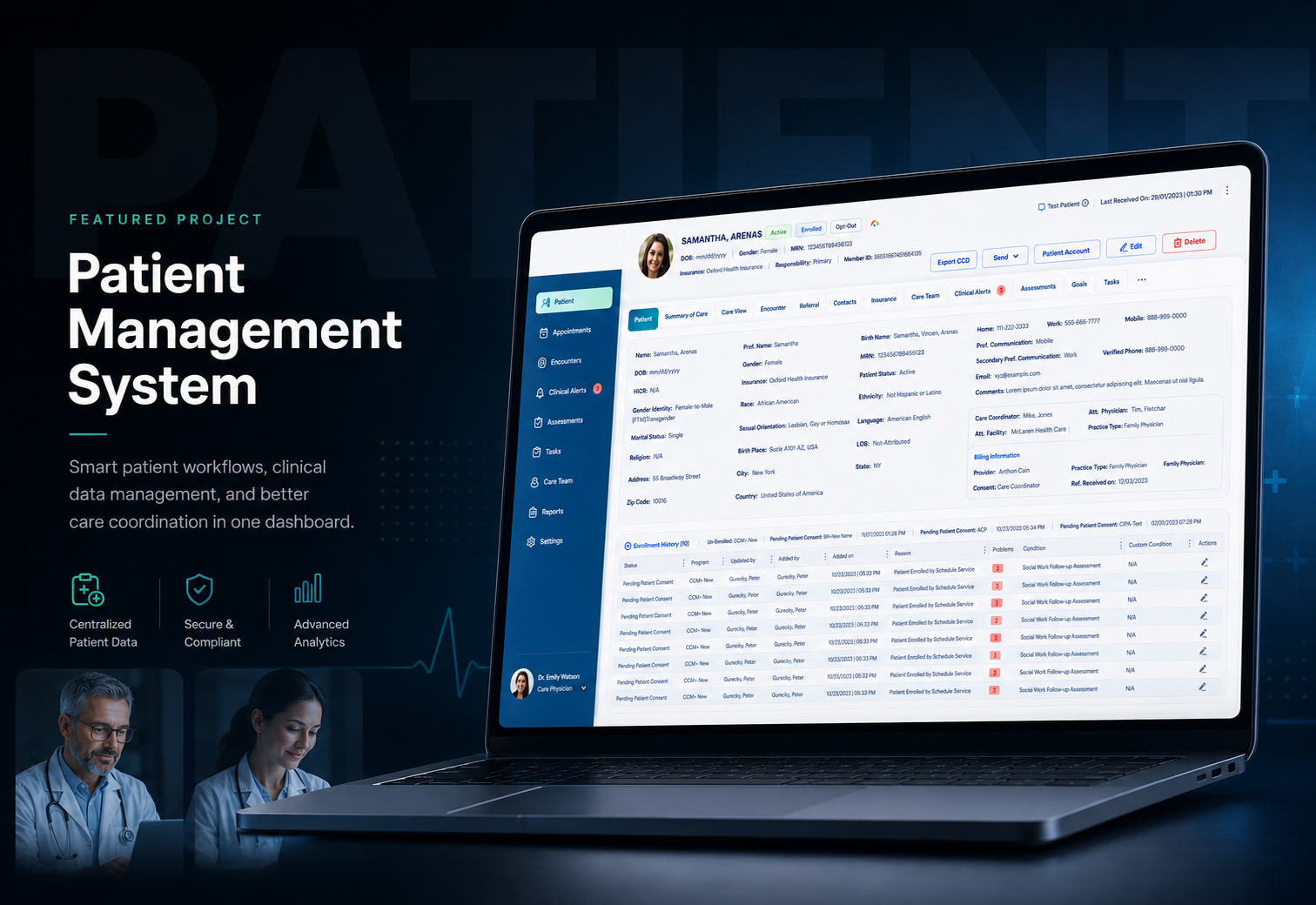
Patient Management System case study main mockup

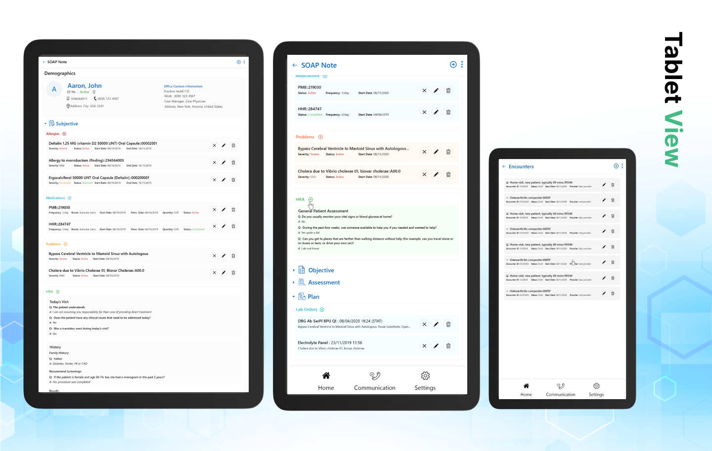
The heart of the product was the patient information screen.

The Patient Information screen became the center of the experience: a dense, high-value workspace where users needed to scan, verify, update, and act quickly. our focus was to bring structure, hierarchy, and confidence into a screen that carried real operational weight.

We designed and built with one rule in mind: healthcare interfaces should reduce hesitation, not add to it.
ServiceUI/UX & Branding + Engineering
IndustryHealthcare
SolutionEnterprise Web Application
Duration5+ years / ongoing evolution

The real UX problem

The challenge was not one isolated screen. It was the relationship between clinical information, administrative actions, billing-related data, and patient context. Users needed a way to understand the patient quickly without losing access to deeper functionality.

  • High-density patient data needed clearer grouping and hierarchy.
  • Legacy UI patterns created inconsistency across modules.
  • Small interaction issues could slow down high-frequency workflows.
  • Modernization had to happen carefully without disrupting production usage.

UX focus — making complex patient information easier to act on

Our UX work focused on reducing cognitive load inside dense clinical and administrative workflows. We treated the screen like a decision environment, not a static form.

01

Information hierarchy

Grouped patient details into clearer sections so users could scan identity, clinical, and administrative information without visually fighting the page.
02

Workflow continuity

Kept frequent actions close to the context where users needed them, reducing unnecessary movement between disconnected screens.

03

Error prevention

Focused on predictable field behavior, clearer validation, and consistent interaction states to reduce uncertainty during updates.

04

Legacy-safe improvements

Improved the interface in controlled layers so the product could evolve without introducing risk into critical workflows.

Designed as a connected product experience.

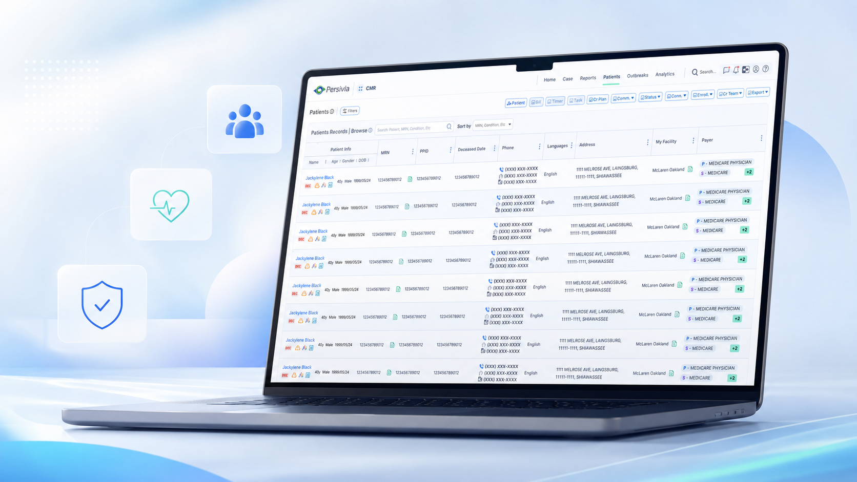
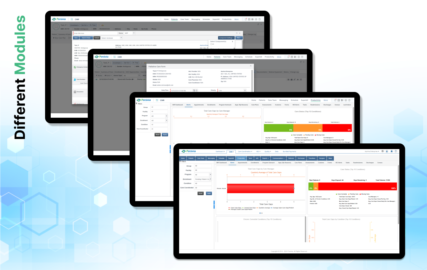
Patient Management System project mockup two
Patient Management System project mockup three
Patient Management System project mockup four
Patient Management System project mockup three
Patient Management System project mockup four
Patient Management System project mockup two
Patient Management System project mockup four
Patient Management System project mockup two
Patient Management System project mockup three

UI focus — calm, readable, production-friendly interface design

The visual direction needed to feel professional and restrained. The goal was not flashy healthcare UI. The goal was clarity, trust, and repeatable patterns.

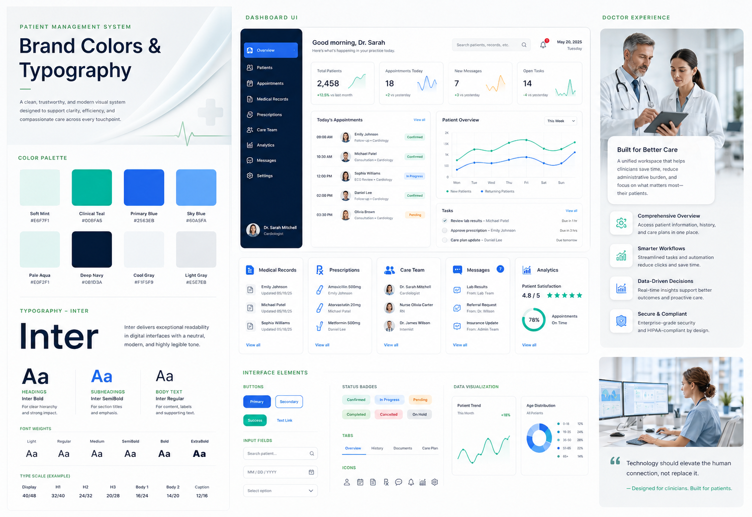
Color

Neutral dark portfolio presentation with warm accent highlights for hierarchy.

Typography

Large editorial headings paired with readable body copy and compact metadata.

Density

Enterprise-level spacing that supports complex data without making the layout feel heavy.

Components

Reusable panels, tables, form patterns, badges, and section structures.

The decisions that shaped the final experience.

01

Patient Information Screen

The most important screen in the product. We focused on making patient information easier to read, easier to trust, and easier to work with across daily healthcare operations.

  • Clearer patient context
  • Better grouping of dense data
  • More structured action areas
02

Scheduling & Operational Flow

Scheduling workflows needed to support speed without becoming visually chaotic. The interface direction focused on reducing decision friction for staff.

  • Readable time/context areas
  • Simplified interaction flow
  • Consistent visual states
03

Billing / Data Heavy Views

Data-heavy healthcare screens require discipline. We worked on improving clarity through spacing, structure, and more consistent frontend patterns.

  • Improved table readability
  • Better field organization
  • Cleaner validation behavior
04

Reusable UI Patterns

Instead of treating each screen separately, We focused on repeatable patterns that could scale across the platform.

  • Reusable layout logic
  • Consistent component behavior
  • Lower long-term UI debt

From understanding the problem to a focused product direction.

01

Understand the existing workflow

Before changing UI, We studied how the current system was being used and where the interface was creating friction.

02

Protect production stability

Because this was a healthcare platform, changes had to be incremental, safe, and compatible with existing usage patterns.

03

Improve the patient information experience

The main focus became the Patient Information screen — the place where clarity, structure, and confidence mattered most.

04

Build reusable frontend patterns

We translated design improvements into practical frontend patterns using Kendo UI and Bootstrap within real project constraints.

Frontend execution

We did not only design the screens. We implemented them inside the actual product environment, working with Kendo UI, Bootstrap, and existing frontend constraints. That meant every design decision had to survive real code, legacy behavior, responsiveness, and production expectations.
Kendo UI customization
Bootstrap-based layouts
Reusable frontend structures
Production-safe modernization
Patient Management System colours and typography presentation

Impact without fake numbers

We do not claim metrics that cannot be verified. The clearest impact of this work is qualitative: more readable screens, more consistent workflows, stronger frontend patterns, and a patient information experience that feels deliberate and dependable.

01

Improved clarity in patient information workflows

02

More consistent UI behavior across modules

03

Reduced visual friction in dense screens

04

A stronger foundation for future modernization

What this project reinforced

This project shaped our approach to complex product design. In healthcare, good UI is not decoration. It reduces hesitation, protects attention, and makes demanding work feel manageable.

Testimonials

Trusted by teams that need better design and cleaner execution

We help startups, agencies, and product teams improve their digital presence with practical UI/UX design, frontend development, and launch support.

BlastUp Labs helped us turn a rough idea into a clean, polished product experience. The design direction was clear, practical, and easy for our team to follow.

Shekinah Tshikulila

Shekinah Tshikulila

Software Engineer

The team improved our frontend workflow and delivered a responsive interface that felt sharp, modern, and production-ready.

Jonathan Yombo

Jonathan Yombo

Software Engineer

The website structure, spacing, and design system saved us a lot of time. Everything felt intentional and easy to scale.

Yucel Farukşahan

Yucel Farukşahan

Creator, Tailkits

Excellent attention to detail. BlastUp Labs helped us create a digital presence that feels clean, premium, and trustworthy.

Rodrigo Aguilar

Rodrigo Aguilar

Creator, TailwindAwesome

BlastUp Labs helped us turn a rough idea into a clean, polished product experience. The design direction was clear, practical, and easy for our team to follow.

Shekinah Tshikulila

Shekinah Tshikulila

Software Engineer

The team improved our frontend workflow and delivered a responsive interface that felt sharp, modern, and production-ready.

Jonathan Yombo

Jonathan Yombo

Software Engineer

The website structure, spacing, and design system saved us a lot of time. Everything felt intentional and easy to scale.

Yucel Farukşahan

Yucel Farukşahan

Creator, Tailkits

Excellent attention to detail. BlastUp Labs helped us create a digital presence that feels clean, premium, and trustworthy.

Rodrigo Aguilar

Rodrigo Aguilar

Creator, TailwindAwesome

The website structure, spacing, and design system saved us a lot of time. Everything felt intentional and easy to scale.

Yucel Farukşahan

Yucel Farukşahan

Creator, Tailkits

Excellent attention to detail. BlastUp Labs helped us create a digital presence that feels clean, premium, and trustworthy.

Rodrigo Aguilar

Rodrigo Aguilar

Creator, TailwindAwesome

BlastUp Labs helped us turn a rough idea into a clean, polished product experience. The design direction was clear, practical, and easy for our team to follow.

Shekinah Tshikulila

Shekinah Tshikulila

Software Engineer

The team improved our frontend workflow and delivered a responsive interface that felt sharp, modern, and production-ready.

Jonathan Yombo

Jonathan Yombo

Software Engineer

The website structure, spacing, and design system saved us a lot of time. Everything felt intentional and easy to scale.

Yucel Farukşahan

Yucel Farukşahan

Creator, Tailkits

Excellent attention to detail. BlastUp Labs helped us create a digital presence that feels clean, premium, and trustworthy.

Rodrigo Aguilar

Rodrigo Aguilar

Creator, TailwindAwesome

BlastUp Labs helped us turn a rough idea into a clean, polished product experience. The design direction was clear, practical, and easy for our team to follow.

Shekinah Tshikulila

Shekinah Tshikulila

Software Engineer

The team improved our frontend workflow and delivered a responsive interface that felt sharp, modern, and production-ready.

Jonathan Yombo

Jonathan Yombo

Software Engineer

The team improved our frontend workflow and delivered a responsive interface that felt sharp, modern, and production-ready.

Jonathan Yombo

Jonathan Yombo

Software Engineer

The website structure, spacing, and design system saved us a lot of time. Everything felt intentional and easy to scale.

Yucel Farukşahan

Yucel Farukşahan

Creator, Tailkits

Excellent attention to detail. BlastUp Labs helped us create a digital presence that feels clean, premium, and trustworthy.

Rodrigo Aguilar

Rodrigo Aguilar

Creator, TailwindAwesome

BlastUp Labs helped us turn a rough idea into a clean, polished product experience. The design direction was clear, practical, and easy for our team to follow.

Shekinah Tshikulila

Shekinah Tshikulila

Software Engineer

The team improved our frontend workflow and delivered a responsive interface that felt sharp, modern, and production-ready.

Jonathan Yombo

Jonathan Yombo

Software Engineer

The website structure, spacing, and design system saved us a lot of time. Everything felt intentional and easy to scale.

Yucel Farukşahan

Yucel Farukşahan

Creator, Tailkits

Excellent attention to detail. BlastUp Labs helped us create a digital presence that feels clean, premium, and trustworthy.

Rodrigo Aguilar

Rodrigo Aguilar

Creator, TailwindAwesome

BlastUp Labs helped us turn a rough idea into a clean, polished product experience. The design direction was clear, practical, and easy for our team to follow.

Shekinah Tshikulila

Shekinah Tshikulila

Software Engineer

AI-Accelerated Delivery

AI + MCP DELIVERY SYSTEMS

Human-led / AI-enabled

Better digital work, delivered faster.

We combine experienced strategy, design, and engineering with AI tools and MCP-connected workflows to research, prototype, build, and refine more efficiently.

Faster exploration. Quicker iterations. Production-ready delivery.

BlastUp Labs team memberBlastUp Labs team memberBlastUp Labs team member

EXPERT DESIGN & ENGINEERING TEAM

Let’s shapewhat comes next.

Skip the long forms and start with one focused 30-minute conversation.

Fast, practical conversations for founders and product teams.
Schedule a 30-Min Call
Loading available times…