
A clear introduction
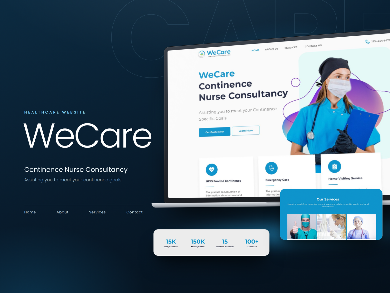
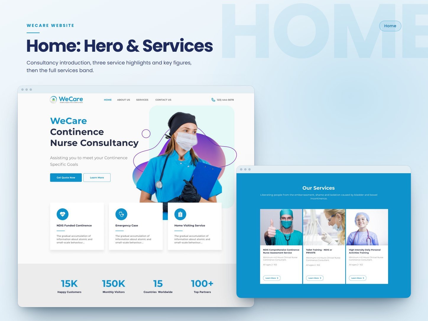
The homepage states who the consultancy is and what it helps with, with a quote request and a learn-more action side by side.

Healthcare / 2023
Designing a healthcare website that makes a sensitive service easy to understand and easy to reach.
WeCare is a continence nurse consultancy. We designed the website and built it on WordPress, with a calm visual language, clear service information, and simple routes to get in touch or book an appointment.
Project overview
The website covers four pages: a homepage that introduces the consultancy and its services, an about page, a services page with service details, and a contact page with an enquiry form, details, and map.
Our approach was to keep everything calm and direct: friendly imagery, a clear blue palette, short sections, and an obvious next step on every page.
The challenge
The site had to serve people looking for help for themselves or for someone they care for. That meant presenting specialist services in plain terms, showing what each service involves, and keeping contact and appointment requests simple.
UX approach
Each page is built to answer one question and then offer a way to act on it.
The homepage states who the consultancy is and what it helps with, with a quote request and a learn-more action side by side.
Service highlights sit directly under the hero, followed by a services band that links to each offering.
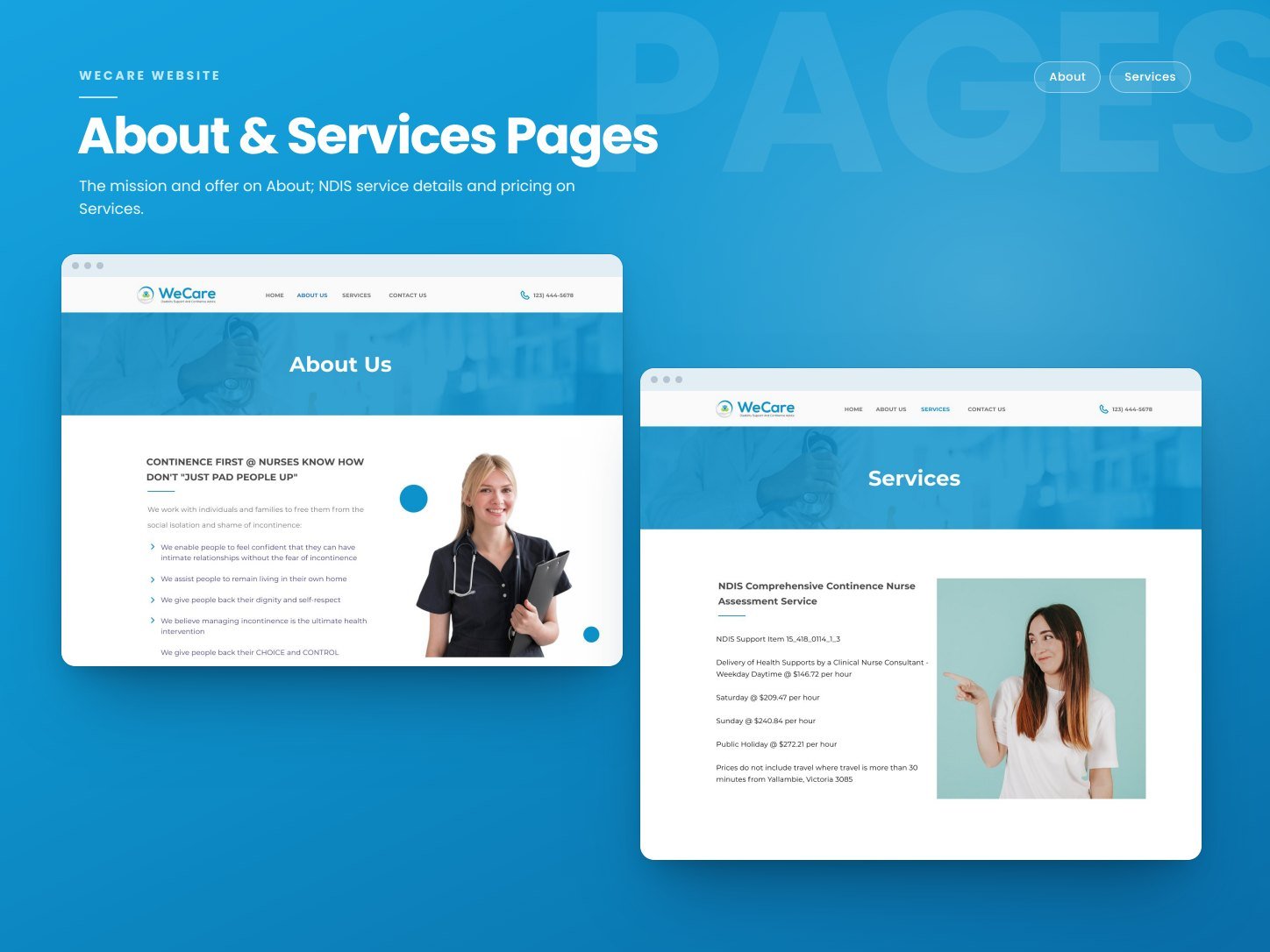
The services page sets out the details of an assessment service, so visitors know what to expect before they enquire.
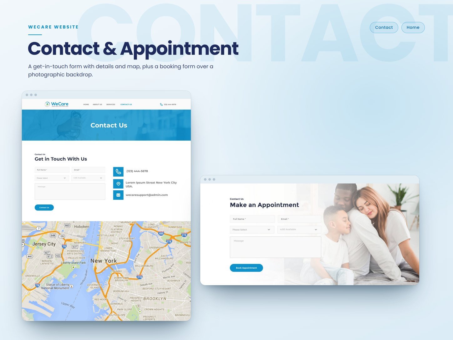
A short enquiry form with contact details and a map, plus a dedicated appointment form, keep the path to help short.
Selected work
The homepage, the about and services pages, and contact.
UI and product direction
The visual language uses a clear blue, plenty of white space, and photography of nurses and families to keep the experience warm rather than clinical.
Our process
We mapped the site to four focused pages: home, about, services, and contact.
We defined a calm blue palette, friendly imagery, and a clean type system suited to a care service.
We designed the homepage, about, services, and contact pages, including the enquiry and appointment forms.
We implemented the design as a responsive WordPress website that the consultancy can update.
Execution
The design was built as a responsive WordPress website. The build focused on clean page templates, working contact and appointment forms, and content the consultancy can manage.
Impact
The completed website gave WeCare a clear, friendly presence that explains its services and gives visitors a simple way to enquire or request an appointment.
Closing perspective
The project reinforced that in care services, tone is part of usability. When the subject is sensitive, plain language, warm imagery, and a short path to contact make it easier for someone to ask for help.
Other projects
AI + MCP DELIVERY SYSTEMS
Human-led / AI-enabled
We combine experienced strategy, design, and engineering with AI tools and MCP-connected workflows to research, prototype, build, and refine more efficiently.
Faster exploration. Quicker iterations. Production-ready delivery.



EXPERT DESIGN & ENGINEERING TEAM
Skip the long forms and start with one focused 30-minute conversation.
Fast, practical conversations for founders and product teams.